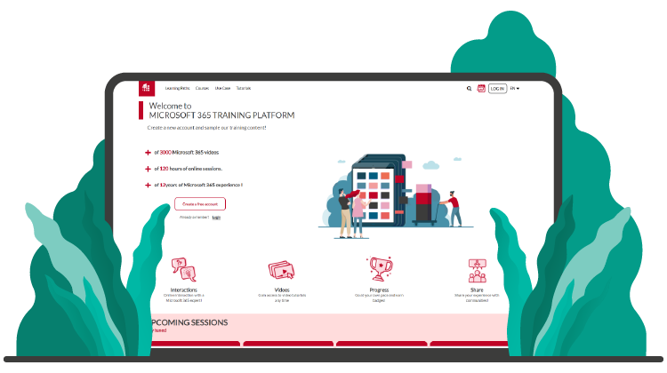
We are delighted to announce that for its 5th anniversary, the MOOC site has changed from the ground up! This new platform is more user-friendly and ergonomic with a sleeker design.
And still, you have access to all its content under the learning paths, courses, tutorials and use cases tabs.
Changes
In general, the interface has become more reader-friendly. The content layout is wider and more immersive on all our site’s pages.
Home page
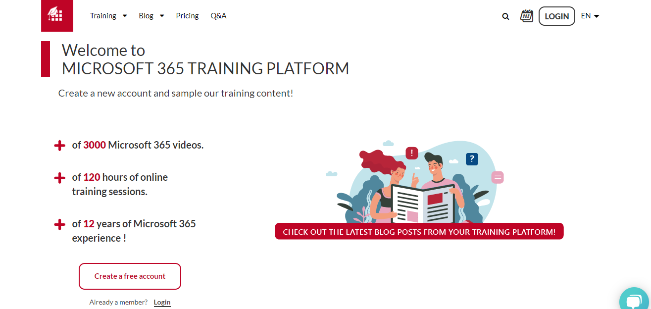
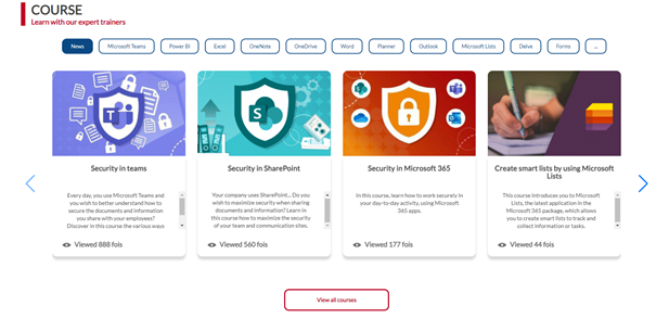
To help you with your training choices on our home page, we added a new filtering system based on tags. Make your selection based on different learning paths, content recommended for you or via the tag "News" to view the latest features. It will be easier to get up to speed!
The dashboard
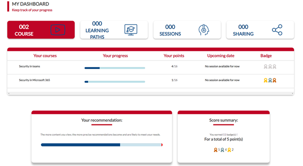
Your dashboard design has also evolved. It is now easier to track its progress.
Courses
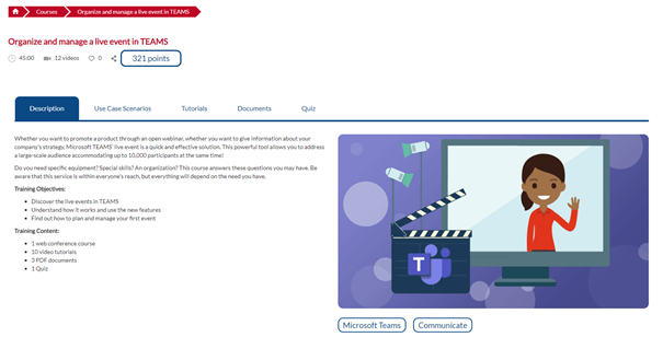
There are also new features in the course layout. Tabs are now available to directly access use cases and tutorial videos. Course content viewing is now easier.
Visit the MOOC Office 365 site to check out the rest of the platform!
In the process, we also need your support and help to correct any abnormalities or malfunctions you may run into. Keep us in the know at this address: support@mooc.office365-training.com
“If you want to go quickly, go alone. If you want to go far, go together” ?
See you soon on the MOOC Office 365 site!
